
网格项上的属性
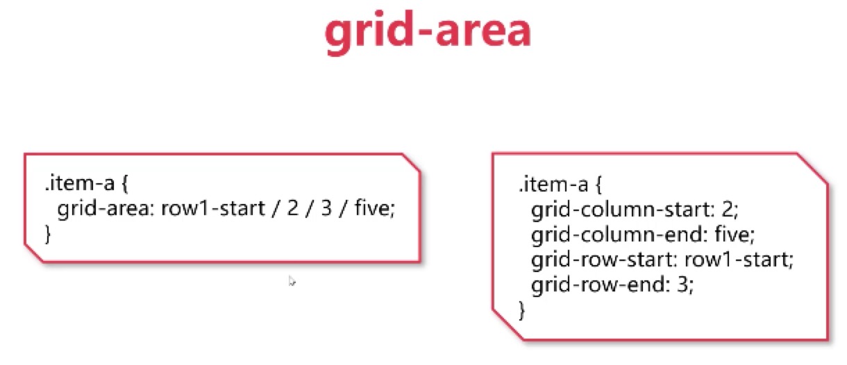
grid-area
概述

等效写法
黑知识
justify-content的start stretch区别
在固定宽度下,没有区别:1
2
3/* 固定宽度下,无区别,中间元素宽度始终为150px */
grid-template-columns:150px 150px 150px;
justify-content:start/stretch;
1 | /* 中间的元素能有多窄就有多窄 */ |
1 | /* 中间的元素有多宽就有多宽 */ |
repeat()
等效写法
1 | .container{ |
1 | .container{ |
auto-fill
auto-fill不能跟具体的数值一起,否则将不起效果。一般与minmax使用,如下:1
2
3.container{
grid-template-columns:repeat(auto-fill, minmax(100px, 150px));
}
auto-fit与auto-fill类似。
fit-content
fit-content 给定网格项定义的宽度,但网格项按照自身的宽度展示。
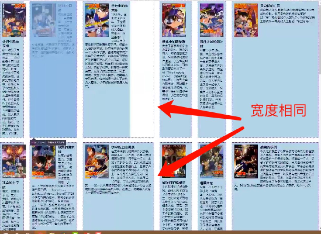
这个属性有个作用是,在多行中,保证定义的列宽度是一致的。1
grid-template-columns:100px fit-content(200px) fit-content(300px) 10% 1fr auto;
合并写法的改名
place-content
这个是合并了 justify-content align-content 的写法。
隐式轨道